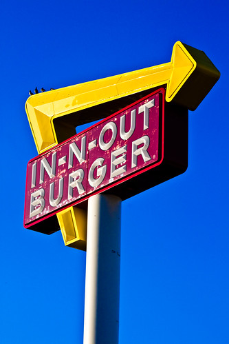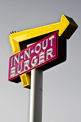

While we are talking about In n Out Burger, I have another story. Remember John Marcotte from yesterday, the guy who proposed a bill to ban divorce in California? Well, as it turns out, he has a blog too and he has a couple articles about In n Out. As some of you may know, In n Out has a secret menu - things they serve that people order, but that aren't on the regular menu. I take advantage of that when I go. The biggest burger on their menu is the double double - two meats and two cheese. But, you can go bigger if you like. So, when I go, I order a three by three or a triple triple if we are to use the same wordings. But they have way more. Check out this post where he describes many of the other secret menu items, complete with pictures!!!
But, back to that putting on as many pieces of meat as you like. I mean, you could go crazy with this, right? Well, someone who writes on his blog took advantage of that......twenty fold. Behold, the 20x20!

I am so tempted to do this just to say I did. But, before my attempt, you have to go over and read the post about this guy's attempt to eat this monstrosity of goodness! It had me cracking up!
Thanks to badmouth.net for the great articles!

9 comments:
I've long thought that In -N- Out has one of the nicest-looking logos. Not sure why; I'm sure part of it has to do with the strong emotional connection - I'm not exaggerating here - that I have with the chain and their burgers. I seriously love them. One of my clients lives within walking distance of an In -N- Out Burger, and you can see their sign from my client's backyard. I've always said, if you've got to have a huge corporate logo visible from your house, that's probably the one.
Personally, I prefer the first shot. The blue sky is unbelievably brilliant, and in no way detracts from the focal point that is the logo.
Thanks for the link! Had fun reading about the 20x20. Call me a wuss, but I've always thought the Double Double - with fries, of course - was just about perfect.
I like the original picture best too - the blue sky is beautiful (gotta love California in December!) The alternate is cool too though - almost art deco-ish? Gotta love the red and yellow in fast food restaurant logos - those colors make us hungry!
I'll read the story about the 20x20 adventure later, but know this: if you try that, bring your defibrillator! This is in NO WAY a challenge, but I don't think you could do it. And if you did, how many burgers would that count as in your burger tally?!
I think I could eat at least half of that burger right about now.
As for the photos, I like the first one with the blue sky in the background the best!
I like the picture with the blue sky best.
We don't have an In-N-Out near us.
I love In-N-Out and both of those pictures. You might enjoy THIS link about all kinds of secret menus. Pretty cool.
I realized that comment looks sort of like a bot 'please to click here'...but it's me :-)
I definitely like the blue - it is so super clear, almost unreal.
I'll read the other later but I don't think you could do the 20x20. the chorizo burger was way too much for you. Don't try it!
The first picture is fantastic.
Wow. That looks like way more than I could handle. I like the sign with the blue background best
Yeah, that first pic is amazing. Unreal blue. Beautiful shot, this would look so amazing as a huge photo display.
Post a Comment